
The 2026 Color Trends That Actually Matter (and How to Use Them at Home)

Every January, the design world explodes with “trend forecasts” — some inspiring, some confusing. Keep in mind that trends are only useful when they help you create a home that feels grounded, intentional, and emotionally aligned with the way you want to live.
So instead of giving you a list of fleeting fads, here are a few 2026 color trends that may impact the way you live in a meaningful, livable way.
🌿 1. Grounded Greens: The New Neutrals
Greens continue their quiet takeover, but 2026 shifts toward earthy, mineral‑based greens that feel restorative rather than trendy.
Think:
- Soft eucalyptus
- Weathered sage
- Muted olive
- Mossy, stone‑washed tones
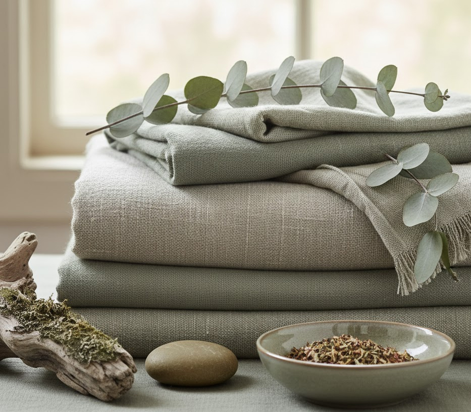
Why it matters: These greens act like neutrals — they pair with woods, creams, blacks, and coastal blues effortlessly. They bring calm without feeling cold.
Where to use it: Bedrooms, bathrooms, entryways, and any space where you want a sense of grounded ease.
🌤️ 2. Sun‑Softened Neutrals
Beige is back, but not the flat contractor beige of the 2000s. 2026 neutrals are warm, sandy, and sun‑kissed, with undertones that feel natural and lived‑in.

Think:
- Sand
- Oat
- Warm linen
- Soft clay
Why it matters: These tones create a gentle backdrop that works beautifully with natural textures — rattan, linen, oak, jute — and they photograph beautifully for online listings or social media.
Where to use it: Living rooms, open‑concept spaces, and anywhere you want a soft, cohesive foundation.
🌊 3. Coastal Blues With Depth
Coastal design is evolving — less “beach house,” more refined, atmospheric blue inspired by fog, deep water, and shifting light.
Think:
- Stormy blue
- Slate blue
- Muted navy
- Misty gray‑blue
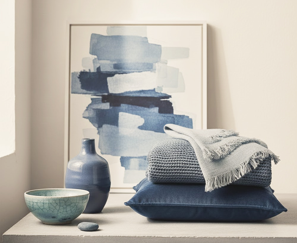
Why it matters: These blues add sophistication without feeling heavy. They’re perfect for creating contrast against warm woods and creamy neutrals.
Where to use it: Cabinetry, accent walls, dining rooms, and bedrooms.
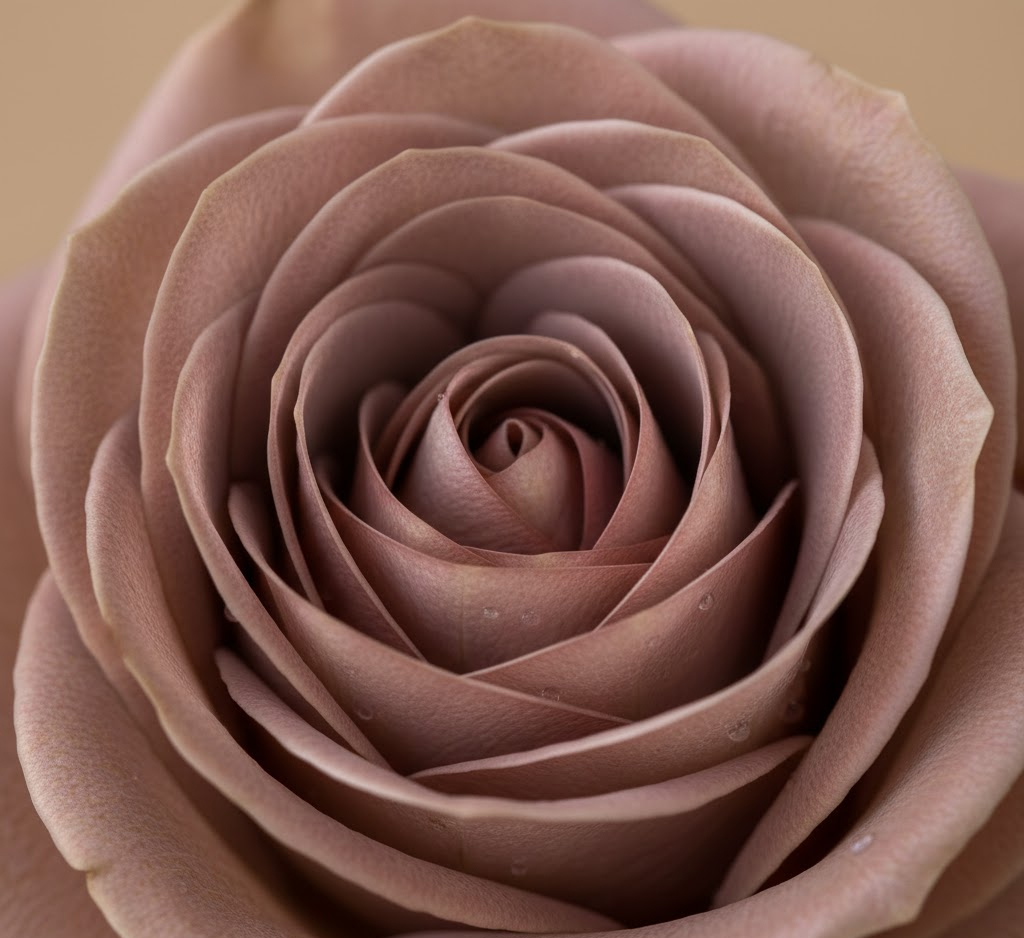
🌸 4. Muted Florals: The Rise of Soft Mauves and Dusty Pinks
2026 brings a wave of romantic, desaturated pinks and mauves — not sugary, not trendy, but elegant and atmospheric.
Think:
- Dusty rose
- Mauve taupe
- Blush with brown undertones
Why it matters: These colors add warmth and personality without overwhelming a space. They’re especially beautiful in low‑light rooms.
Where to use it: Bedrooms, reading nooks, powder rooms, textiles, and art.
🖤 5. Black Accents for Structure
Black isn’t a trend — it’s a tool. But in 2026, it becomes essential for giving softness and neutrals a sense of structure.
Think:
- Black window frames
- Black hardware
- Black picture frames
- Black side tables

Why it matters: Black creates visual clarity. It anchors airy palettes and makes a room feel intentional.
Where to use it: Anywhere you want definition or contrast.
🌾 6. Nature‑Driven Contrast: Warm + Cool Together
One of the most important shifts in 2026 is the move away from “all warm” or “all cool” palettes. Instead, designers are embracing balanced contrast inspired by nature.

Think:
- Warm woods + cool blues
- Soft greens + warm neutrals
- Black accents + creamy whites
Why it matters: This creates depth, dimension, and a sense of harmony that feels timeless.
Where to use it: Whole‑home palettes, open‑concept spaces, and transitional design styles.
How to Use These Trends in Your Own Home
Trends should never dictate your home — they should support it. Here’s how to apply them intentionally:
✔ Start with the mood you want
Do you want your home to feel calm? Energizing? Cozy? Sophisticated?
✔ Choose a dominant neutral
This becomes your anchor — everything else builds around it.
✔ Layer in one or two trend‑driven colors
Not all six. Just the ones that resonate with your personal style.
✔ Use black sparingly but intentionally
A little goes a long way.
✔ Test samples in real light
Morning light, afternoon light, and evening light all tell different stories.
Want a curated palette that takes the guesswork out?
If you want a ready‑to‑use, designer‑crafted color story, my custom interior paint consultations provide complete whole home palettes with paint codes, room placement suggestions, and example imagery — all designed to help you create a home that feels calm, cohesive, and beautifully intentional.
