
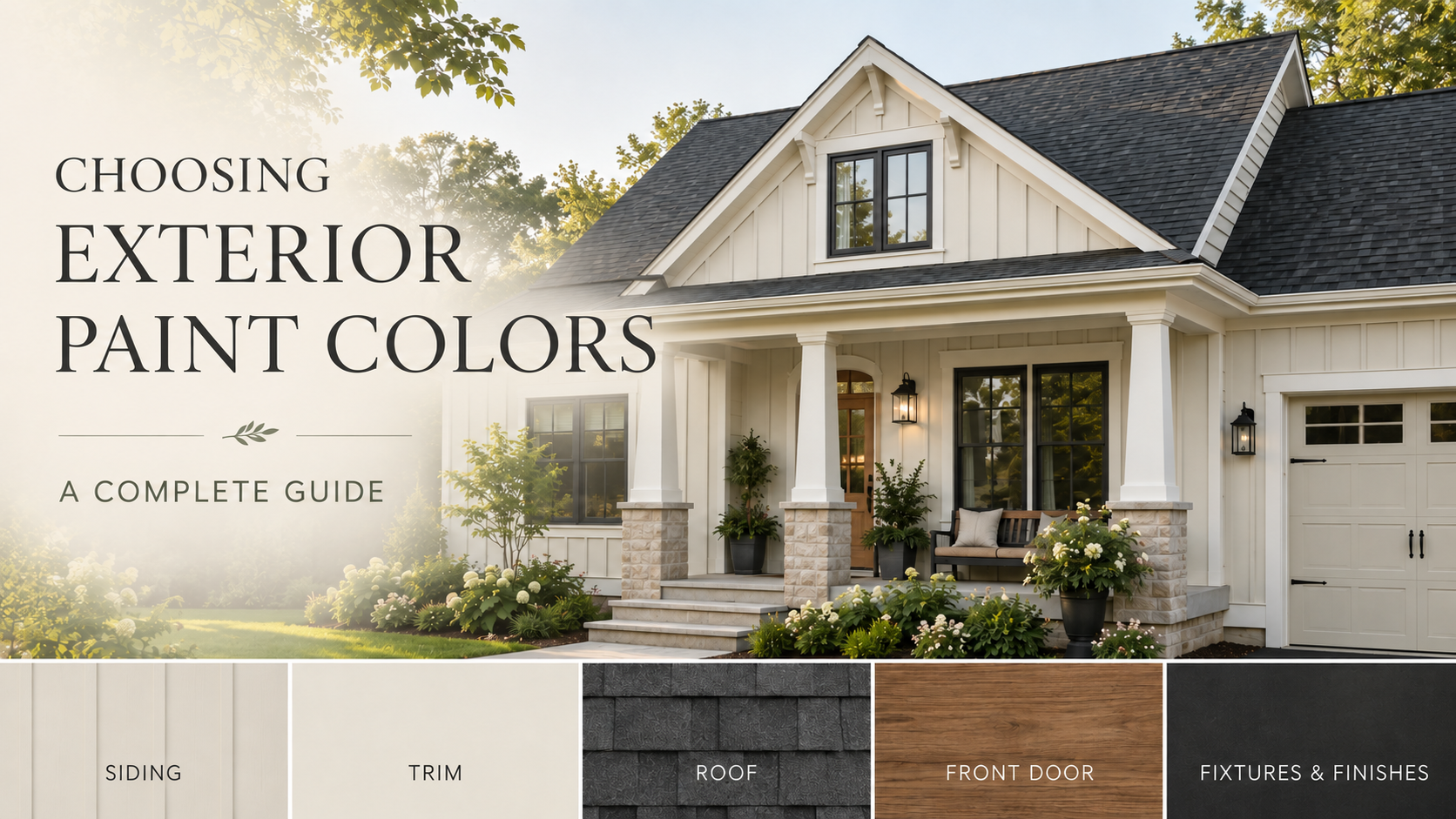
Choosing your home’s exterior colors involves much more than finding a paint swatch you love. Roofing, brick, stone, windows, landscaping, architectural details, and natural light all affect how a color will appear—and whether the finished exterior feels cohesive.
The most successful palettes begin with the parts of the home that are not changing. From there, each selection should support the architecture and create a clear relationship between the main body color, trim, doors, garage, and permanent materials.
Use this guide to build an exterior palette in a thoughtful order, understand where each color belongs, and avoid choosing each finish as an isolated decision.
Begin With the Parts of the Home That Are Staying
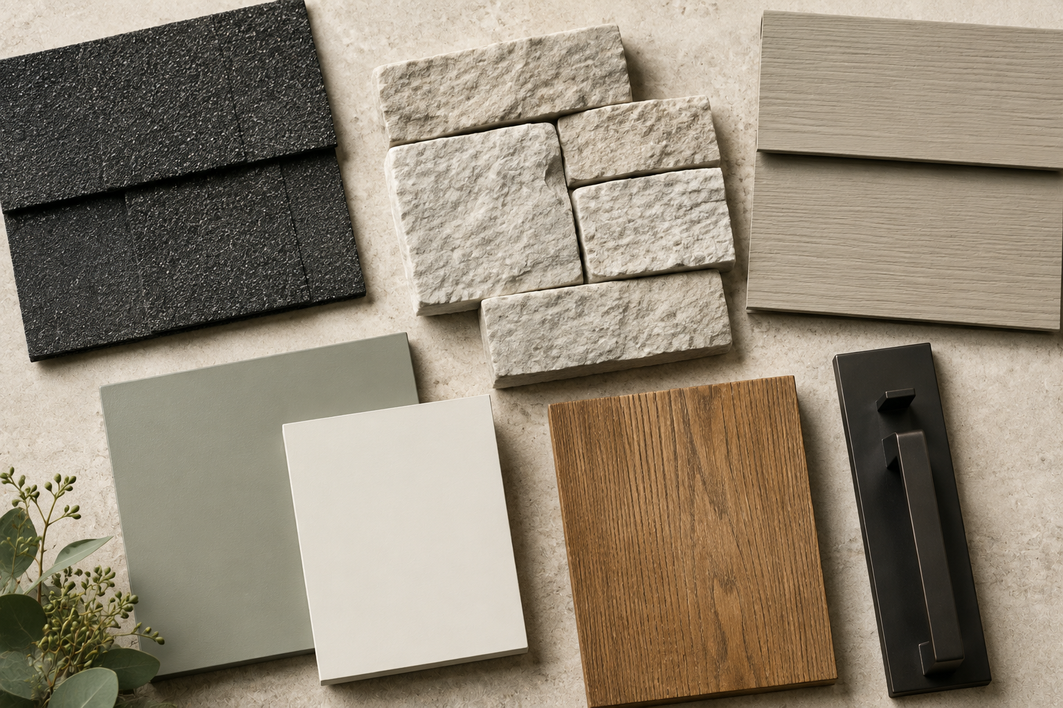
Paint should work with your home’s permanent materials—not attempt to disguise or compete with them. Before looking at siding colors, identify every exterior element you are not planning to replace.
- Roofing and shingles
- Stone, brick, or masonry
- Window and door frames
- Driveways and pathways
- Decking and fencing
- Established landscaping
Look closely for the undertones running through those materials. A roof may appear gray at first glance but contain warm brown, green, blue, or charcoal notes. Brick may lean orange, burgundy, taupe, cream, or violet. Stone often contains several undertones at once.
The Best Order for Choosing Exterior Colors
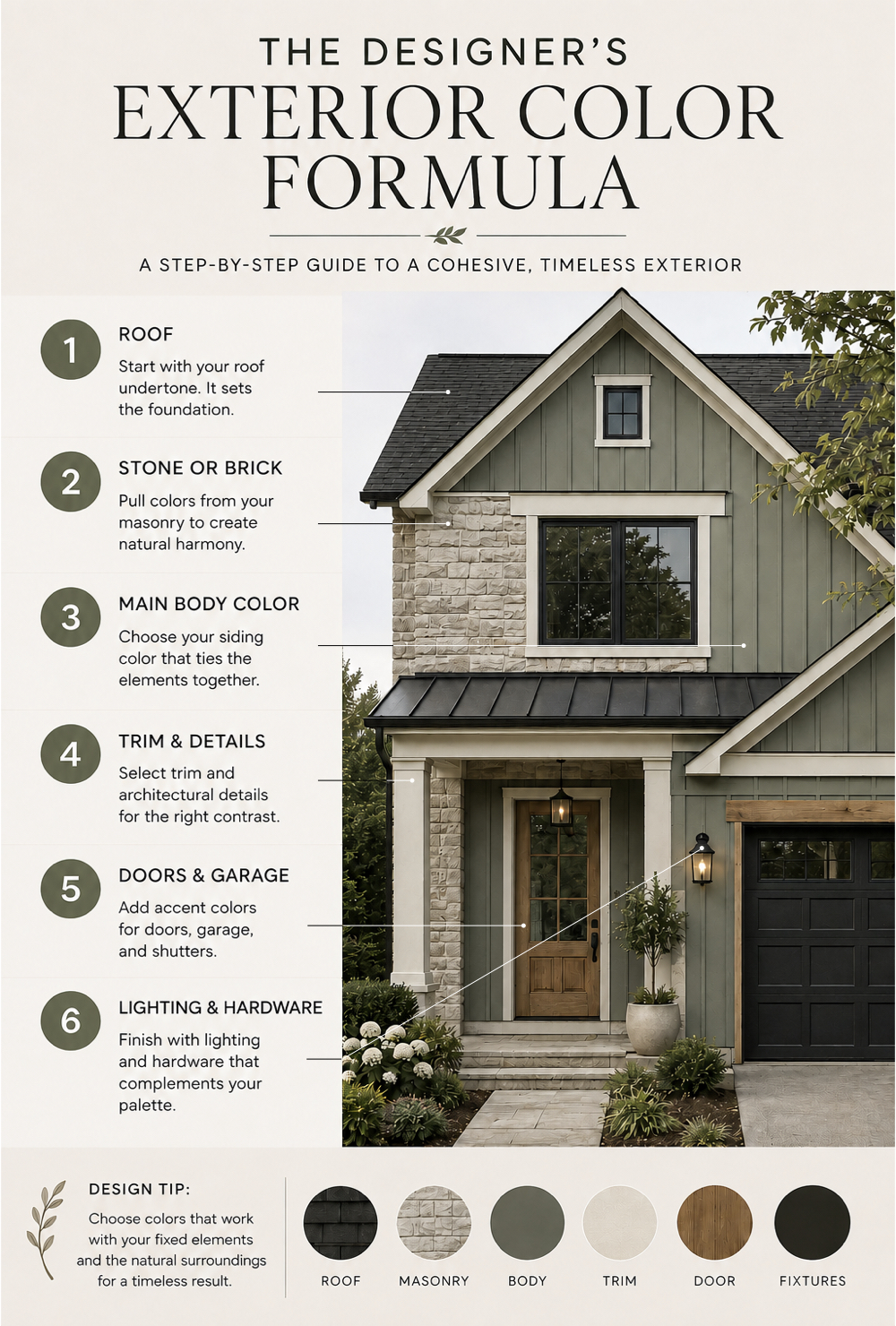
Choosing selections in the right order reduces guesswork. Begin with the element that gives you the fewest options, then move toward the finishes that are easiest to adjust.
Identify the roof undertone
The roof covers a large visual area and is expensive to change. Decide whether it reads warm, cool, earthy, neutral, or high contrast before selecting siding.
Pull colors from stone or brick
Rather than attempting to match masonry exactly, select a related neutral that supports one of its quieter undertones.
Choose the main body color
The siding or stucco color establishes the overall feeling of the exterior. It should connect the roof and masonry without making either one feel disconnected.
Decide how much trim contrast you want
Crisp contrast emphasizes architecture. Softer contrast feels more tonal and refined. Neither approach is universally better; the right choice depends on the home’s style and level of detail.
Select doors, garage colors, and accents
Use these secondary elements to create warmth, depth, or a controlled focal point. Not every door or architectural detail needs a different color.
Coordinate lighting and hardware last
Exterior lighting, house numbers, door hardware, and metal finishes should reinforce the completed palette rather than introduce an unrelated finish.
Build a Simple Three-Color Foundation
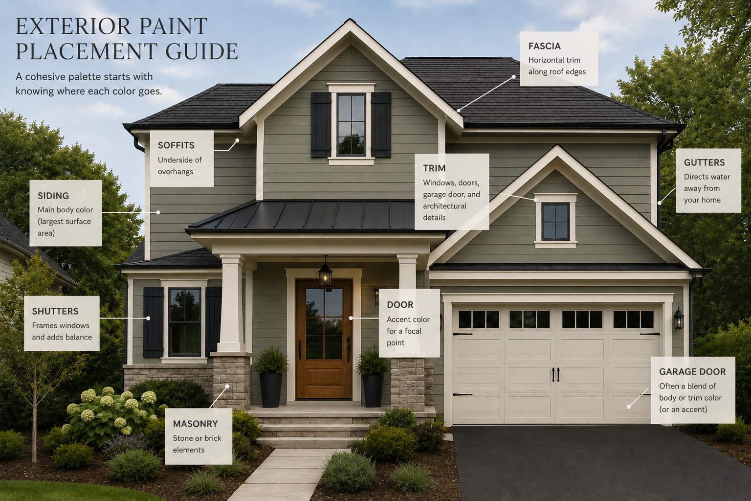
Most homes benefit from a restrained exterior foundation. Additional materials may be present, but the paint colors themselves should have clearly defined roles.
Main Color
Siding, stucco, or the largest painted surface.
Trim Color
Fascia, soffits, window trim, columns, and decorative details.
Accent Color
Front door, shutters, select garage doors, or another focal element.
Porch ceilings, railings, secondary siding materials, and fences can introduce additional finishes, but each should still relate to this central three-color story.
Choose a Main Color That Supports the Architecture
The main body color is the backdrop for every other finish. Instead of beginning with a trend, consider what direction makes sense for the home’s architecture, setting, and permanent materials.
Airy and timeless, particularly with warm stone, cedar, or darker roofing.
Grounded and versatile for homes with mixed warm and cool materials.
Natural and refined in wooded settings or alongside warm masonry.
Softly coastal or classic when balanced with warm white and natural wood.
Architectural and dramatic, especially on homes with simple lines.
Quiet and sophisticated when the siding and trim vary only slightly.
Trim Does More Than Frame the Windows
Trim controls how strongly the architecture is outlined. Bright white trim against dark siding creates a crisp, graphic result. A creamier or more tonal trim produces a softer, more integrated exterior.
Homes with elaborate moldings, columns, and decorative details can often support greater contrast. Simpler architecture may look more elevated with a quieter relationship between the body and trim colors.
Do the gutters need to match the trim?
Not necessarily. Gutters and downspouts are usually most successful when they visually recede. Depending on their placement, that may mean matching the fascia, siding, roof, or another nearby surface rather than automatically making them a contrasting trim color.
Should the garage doors be an accent?
In most cases, the garage should not be the first thing the eye notices. Consider matching the garage doors to the siding, selecting a related tonal color, or using a restrained wood finish. Reserve strong contrast for a garage that is intentionally part of the home’s architectural statement.
Use the Front Door as a Controlled Focal Point
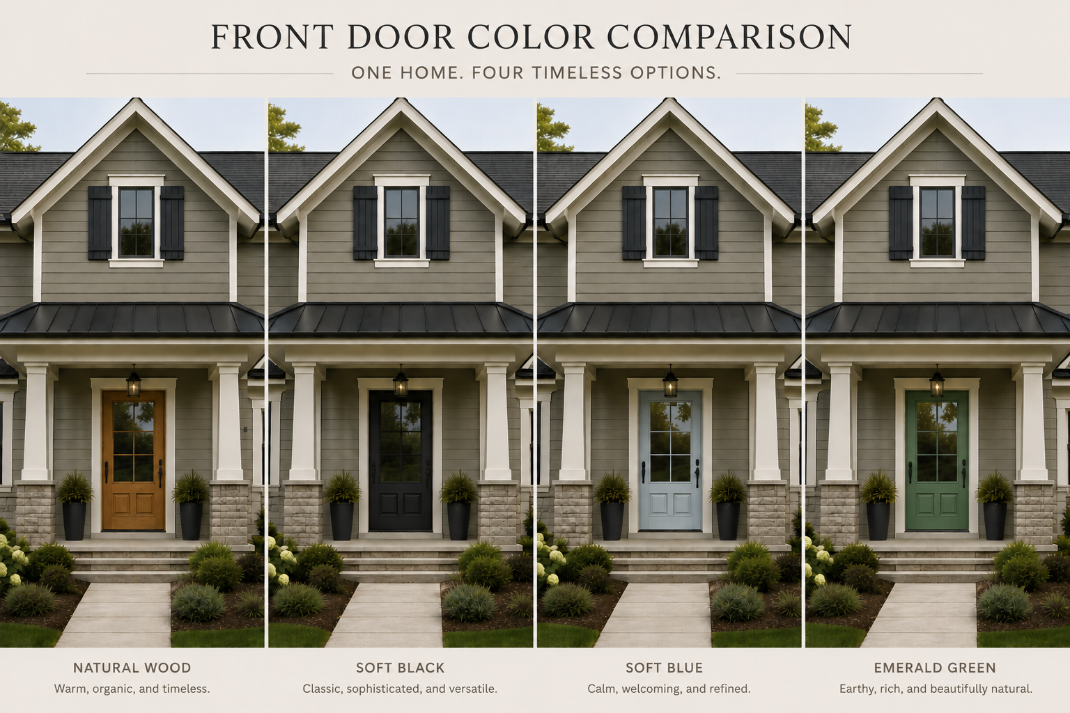
The front door is an opportunity to add personality, but it still needs to belong to the overall exterior. Natural wood, soft black, muted blue, bronze-green, deep plum, and other complex colors can all work when they repeat an undertone found elsewhere.
The door does not need to be a bright “pop” of color. A subtle shift in depth, warmth, or material may create a more sophisticated focal point than a highly saturated hue.
Test Every Color in Real Exterior Light
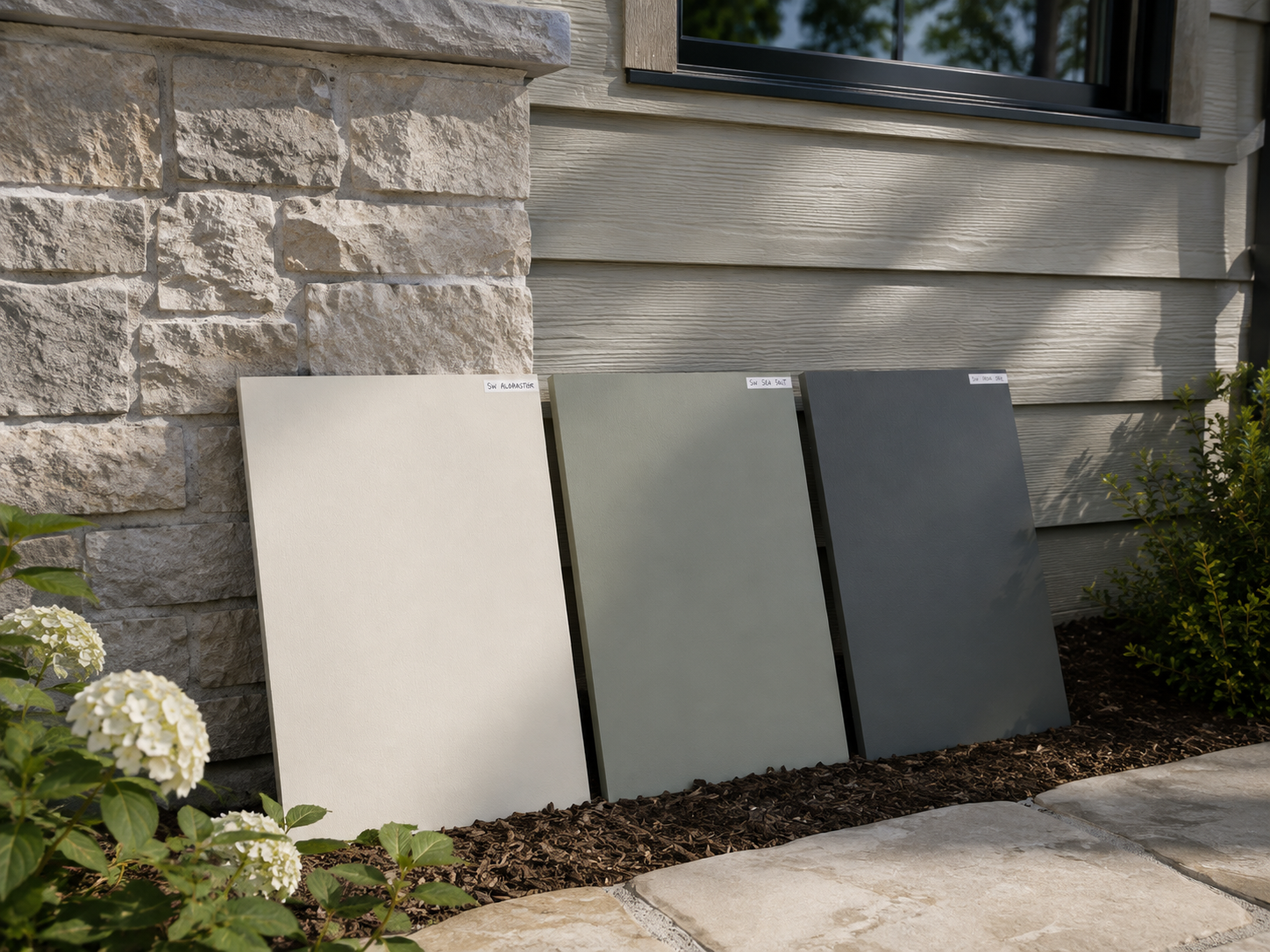
Exterior paint changes throughout the day and can look different on each side of the house. Small hand-held swatches are not large enough to show how a color will behave across a broad surface.
Apply large samples to more than one elevation and review them over several days.
- Morning light
- Midday sun
- Late-afternoon light
- Deep shade
- Bright overcast conditions
- Beside the roof and masonry
North-facing surfaces often appear cooler. South-facing walls receive more direct warmth. East-facing walls brighten in the morning, while west-facing elevations can become warmer or more intense later in the day.
Five Details That Commonly Disrupt an Exterior Palette
1. Choosing a white that is too bright
Pure, high-reflectance whites can appear stark outdoors. A softened white with a carefully chosen warm or neutral undertone is often easier to integrate with roofing and masonry.
2. Treating every material as a separate feature
Brick, stone, siding, shutters, trim, garage doors, and wood accents do not all need equal visual importance. Decide which element is the feature, then allow the remaining finishes to support it.
3. Adding contrast to every architectural detail
Highlighting too many elements can make an exterior feel fragmented. Contrast is most effective when it directs attention intentionally.
4. Selecting colors from indoor photographs
A color used successfully in an interior may behave very differently in direct sunlight. Evaluate exterior examples and always test on the actual home.
5. Choosing paint before confirming builder materials
Roofing, windows, stone, brick, and garage-door options can narrow the suitable paint choices. Confirm those selections first whenever possible.
A Calm, Cohesive Muted-Green Exterior
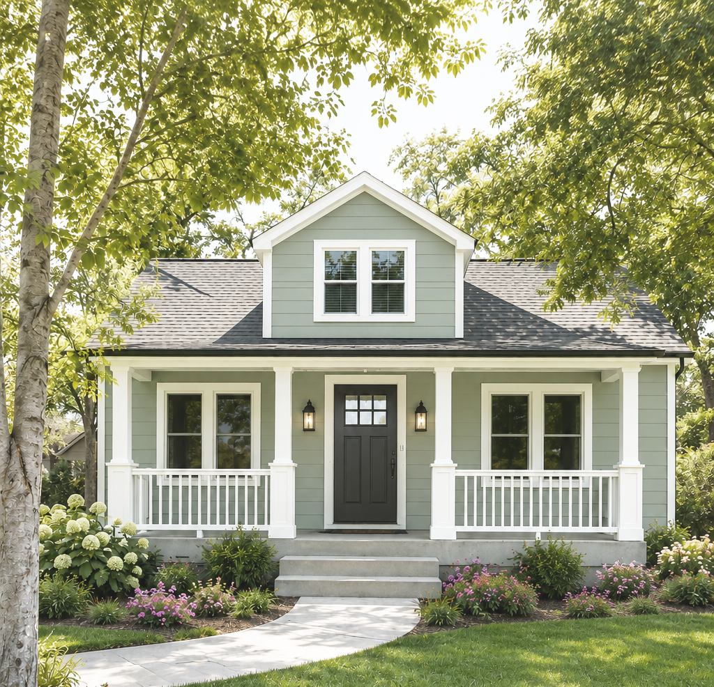
Prefer to begin with a professionally coordinated palette? This ready-made exterior guide combines a softened green body color, warm white trim, dark architectural accents, and natural wood for a timeless look that feels connected to its surroundings.
Before You Finalize Your Exterior Selections
Review the entire palette together rather than approving one finish at a time.
- Does the siding support the roof and masonry undertones?
- Is the trim contrast appropriate for the architecture?
- Do the garage doors recede or stand out intentionally?
- Does the front door feel connected to the complete palette?
- Are gutters and downspouts visually integrated?
- Do lighting and hardware finishes repeat elsewhere?
- Have the colors been tested on multiple elevations?
- Does the home still feel cohesive from a distance?
A Cohesive Exterior Is Built One Relationship at a Time
A successful exterior palette is not defined by one perfect paint color. It comes from creating thoughtful relationships between the roof, masonry, siding, trim, doors, garage, landscaping, lighting, and architectural details.
Begin with what cannot change, limit the number of competing finishes, and test every selection in the home’s actual surroundings. The result will feel more timeless, intentional, and appropriate to the architecture.
Need Help Before You Finalize Your Exterior Selections?
An exterior consultation gives you professional guidance before you commit to siding, paint, roofing, masonry, trim, doors, lighting, and other permanent exterior decisions. Whether you are starting from scratch, narrowing down builder options, or looking for reassurance, I’ll help you create a cohesive palette tailored to your home.
Explore Exterior Design Services