
Which White Paint Should You Choose?

Which White Paint Should You Choose?

You walk into the paint store expecting to choose between a few shades of white and suddenly find yourself staring at dozens—or even hundreds—of options with names like Alabaster, Snowbound, Pure White, White Dove, Swiss Coffee, Chantilly Lace, Simply White, and countless others.
How can there possibly be that many versions of white?
And more importantly, how are you supposed to choose the right one?
The good news is that designers don’t compare hundreds of white paint colors. We have a process for narrowing them down quickly—and you can use the same approach.
Why Are There So Many White Paint Colors?
The short answer: because not all whites are intended to do the same job.
A crisp, bright white used on trim has a completely different purpose than a soft white with subtle pink undertones used on the walls of a nursery. A creamy warm white chosen to brighten and warm a basement will feel very different from a fresh, clean white used throughout a breezy coastal home.
Some whites are designed to feel warm and inviting. Others are meant to feel crisp and modern. Some are selected specifically to complement warm wood tones, while others are chosen to balance cool gray finishes.
White paint isn’t just about color—it’s about creating a particular mood and working with the unique conditions of a space.
That’s why paint manufacturers offer so many options. The “right” white depends on the room, the lighting, the existing finishes, and the feeling you’re trying to create.

Understanding Undertones
Every white paint color contains subtle undertones that influence how it appears on your walls.
Some whites have:
- Yellow undertones
- Beige undertones
- Gray undertones
- Green undertones
- Blue undertones
- Pink undertones
These undertones may seem invisible on a tiny paint chip, but once they’re spread across an entire room, they become much more noticeable.
A white with yellow undertones may feel warm and welcoming. A white with blue undertones may feel crisp and fresh. A white with gray undertones can create a soft, sophisticated backdrop.
The key is choosing undertones that work with your home’s existing finishes and the atmosphere you want to create.
The Biggest Mistake People Make
Most homeowners start by asking:
But that’s actually the wrong question.
The better question is:
“What white paint color is best for my space?”
There is no universally perfect white.
Instead of trying to find the most popular white, focus on finding the white that complements your specific finishes, lighting, and desired design style.
How Designers Narrow Down White Paint Colors
When I’m selecting white paint for a client, I don’t start with 200 colors.
I start by eliminating most of them immediately. Whites can almost always be narrowed down to 5 main options and a few similar alternatives. Ask yourself the following questions.
Q1: Do You Want a True White?
The easiest way to narrow down hundreds of white paint colors is to first determine whether you’re looking for a true white or a white with noticeable undertones.
True whites are bright, clean whites with very little visible undertone. Because they don’t lean strongly yellow, pink, blue, or green, they’re incredibly versatile and tend to work well with most finishes and design styles.
True whites are especially popular for trim, ceilings, cabinetry, and bright, airy interiors where you want the space to feel fresh and clean without feeling stark.
The good news? Most paint brands only have a handful of true whites. If a true white is what you’re after, you can immediately eliminate most of the paint deck and focus on those few options instead.
While there isn’t a perfect formula, true whites often have a high LRV (typically 83+) and RGB values that are relatively balanced, indicating that the color doesn’t strongly favor one undertone over another.
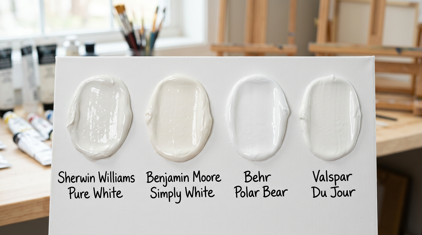
Popular examples include Sherwin-Williams Pure White, Benjamin Moore Simply White, Behr Polar Bear, and Valspar Due Jour.
Q2: Do You Want a Warm White?
If you’ve determined that a true white isn’t what you’re after, the next question is whether you want a warm white.
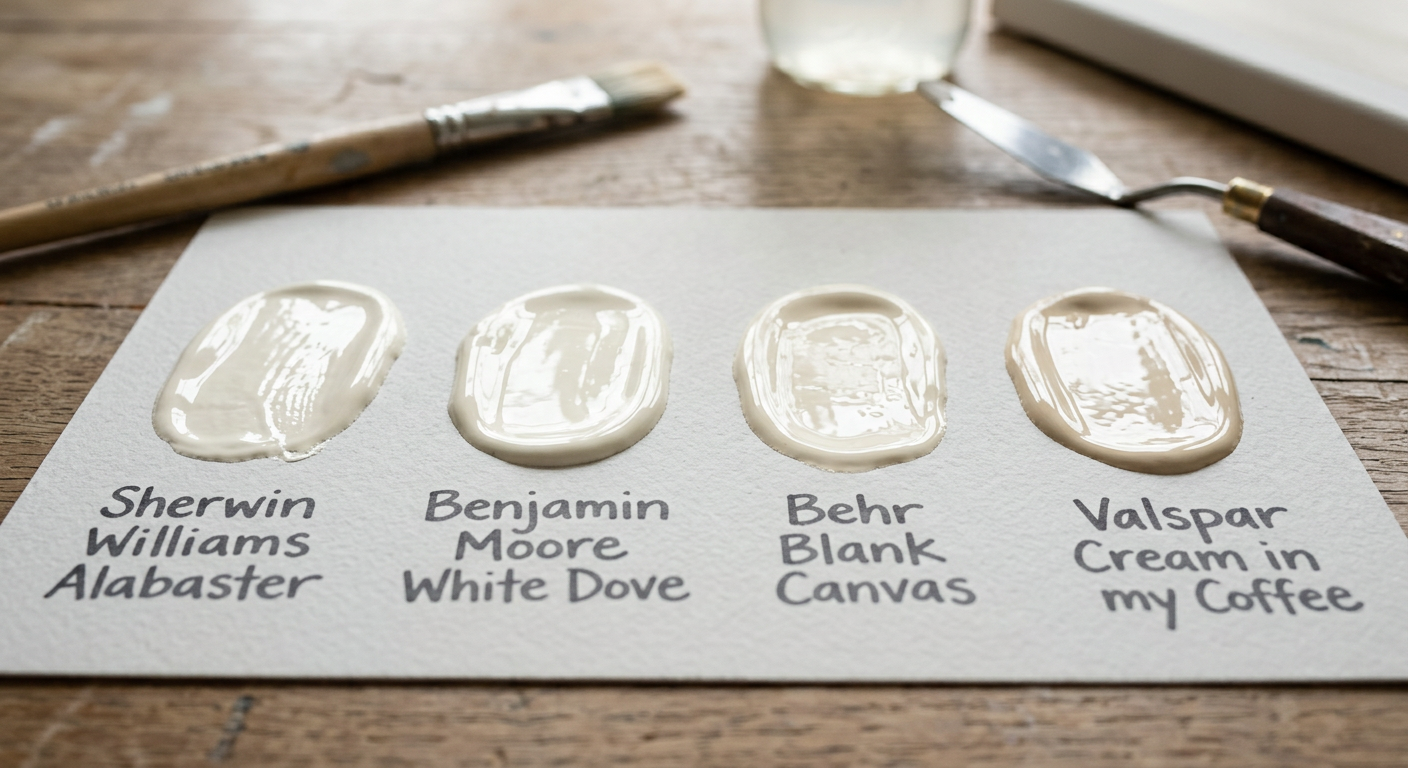
Warm whites are often the most challenging category because they can lean in several different directions. Some have soft yellow undertones, others lean beige or greige, and some can even reveal subtle pink or peach undertones in certain lighting conditions.
If you’re unsure, circle back to the goals for the space. Are you trying to create a bright, airy backdrop with just a touch of softness? Or are you looking for a creamy white that adds warmth and depth to the room?

If you’re simply looking for something slightly softer than a true white, start by exploring colors that are one or two steps warmer than your brand’s true white (i.e. go down 1 or 2 shades on the paint chip).
If you’re drawn to richer, creamier whites, focus on your brand’s medium off-whites. These colors often have LRVs between 75 and 82 and typically contain stronger warm undertones that create a cozy, welcoming feel but stop just short of beige or tan territory.
As you compare options, don’t forget to consider your lighting. South-facing rooms receive warm natural light that can intensify creamy undertones, while east-facing rooms often appear warmer in the morning. West-facing rooms tend to become noticeably warmer later in the day. A white that feels perfectly balanced on a paint chip may look significantly warmer once it’s on your walls, depending on lighting.
Q3: Do you want a cool, bright white?

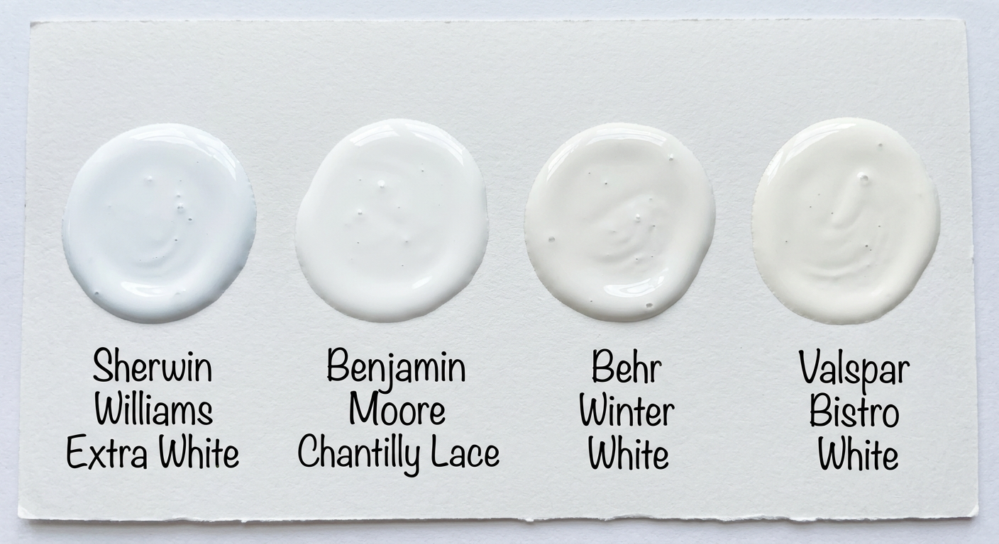
Cool, bright whites are often associated with modern, minimalist, and coastal interiors. While they can sometimes feel stark or sterile when overused, they can be incredibly effective when the goal is a fresh, crisp, and light-filled space.
Bright whites are especially useful for trim, doors, and millwork because they create clear contrast against warmer wall colors and help define architectural details. They can also act as a visual anchor, tying together different paint colors and finishes throughout an open floor plan.
These shades are a popular choice for ceilings, as they help maximize light reflectance and create a clean, airy backdrop. They’re also well-suited for bathrooms, laundry rooms, home offices, and other spaces where bright, clear lighting is beneficial.
If your style leans coastal, contemporary, Scandinavian, or modern minimalist, a cool bright white can help achieve that fresh, breezy look. Just be mindful of your lighting; north-facing rooms can intensify cool undertones, making some bright whites appear even crisper than expected.
Q4: Do you want a white with a hint of color?
Not every “white” has to look white. Some of the most beautiful and livable paint colors are soft off-whites with just a whisper of color woven into them. These shades can add warmth, personality, and subtle depth while still feeling light and neutral.
Whites with hints of blue, green, gray, blush, or beige can be a wonderful choice for bedrooms, nurseries, bathrooms, and other spaces where you want a softer, more inviting atmosphere. They’re also particularly useful in rooms that lack natural light, where a touch of color can keep the space from feeling flat or washed out.
The key is subtlety. Rather than reading as an obvious color, these shades create a gentle mood and can help reinforce your overall design style—whether that’s coastal, organic, traditional, or contemporary.
If you’re drawn to color but aren’t ready to commit to fully colored walls, a tinted white can be the perfect middle ground. Most paint color families are arranged from lightest to darkest on the paint chip, so if you love a particular color but want something softer, look toward the top of the strip. If you’d like a bit more color and depth, move down a shade or two.

Compare Only a Small Group of Finalists
By now, you’ve likely identified which category of white best fits your space:
- True whites
- Warm whites
- Cool bright whites
- Whites with a hint of color
Once you’ve narrowed your search to a category, the decision becomes much more manageable. Instead of sorting through hundreds of paint colors, you’re comparing a small group of whites that already align with your lighting, finishes, and design goals.
Navigate to your category and select just a few samples in that same color family (lighter/darker/grayer/warmer).
That’s it.
The Bottom Line
The reason there are so many white paint colors is simple: different homes, different lighting conditions, and different design styles require different whites.
The key isn’t finding the most popular white paint color.
It’s identifying the type of white that works best for your space, understanding how your lighting affects color, and narrowing your options to a small group that supports the overall look you’re trying to achieve.
Once you’ve identified the goal for your “white”, choosing the right one becomes far less overwhelming—and much more intentional.
Still Stuck Between Whites?
My Interior Paint Consultation takes the guesswork out of paint selection by evaluating your lighting, finishes, and design goals so you can move forward with confidence.
Book a Paint Consultation